If you have been living under a rock or simply aren’t into Formula 1 racing, the news of the new regulations and design of the cars have probably slipped your mind. Here to help you catch up with the rest of us (and possibly mock the new front ends together of course) are the new designs of the 2104 Formula Cars.
This post has nothing to do with technicalities or in-depth details of how the designs help the cars during a race, but rather to harshly judge those we like and those who we do not. Without further ado here are the entrants to the Formula 1 2014 season.
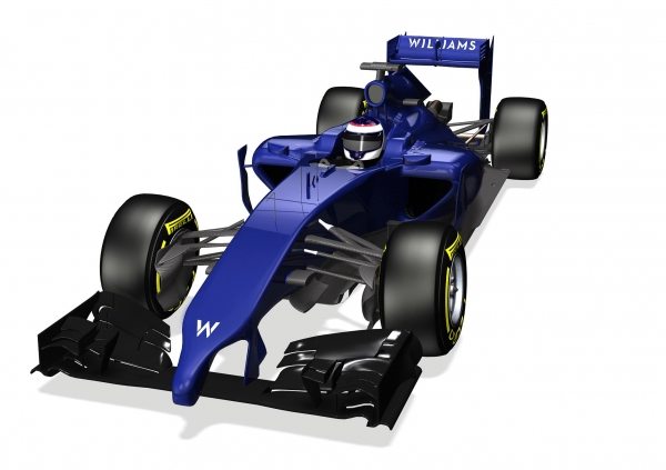
This is the Williams FW36 Car. At the moment they only had imagery of the render, but we are sure it closely resembles the actual vehicle. We are specially intrigued at how they will perform this year as it has been stated in previous press releases that some of the technology used for this car may show up in the next Nissan GT-R considering they are in close collaboration for that car.
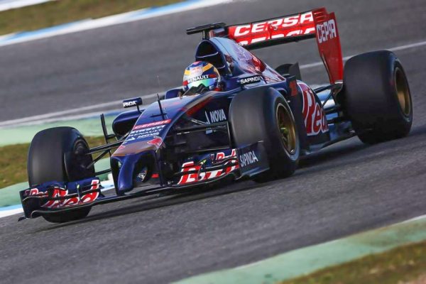
This is the STR9 and belongs to the Toro Rosso Formula 1 racing team. Toro Rosso, as our team of F1 Specialists state, is another team sponsored by Red Bull but is not the Infiniti backed champion of last year. The vehicle above is what they’ll be commanding this year.
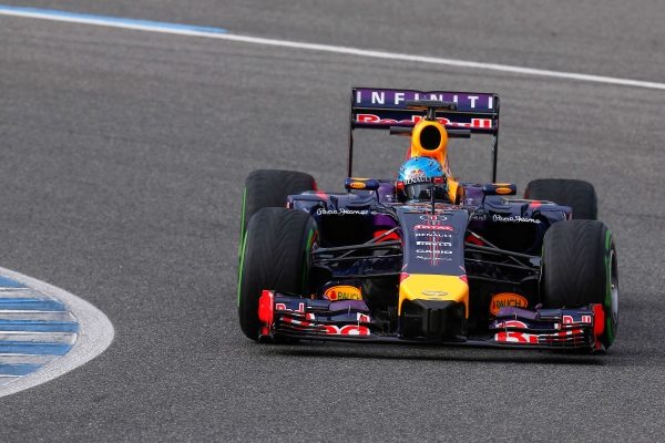
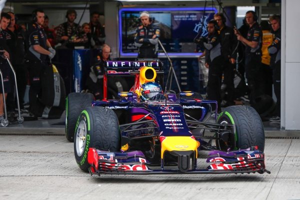
The actual champions, the Red Bull team, will return to the 2014 season with the RB10 and unlike many of the other cars in the F1 line up it doesn’t rock the “Gonzo” nose. Good call in our book as those cars look extremely funky. Sebastian Vettel is poised to defend his championship once again this year.
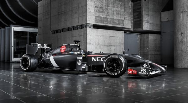
Sauber’s C33-Ferrari looks very ominous in this lower profile shot. All though they too have the “Gonzo” nose, in this angle it actually looks pretty cool. We will have to see if this design is a winning one since many of the competitors seem to be rocking the phallic-like style.
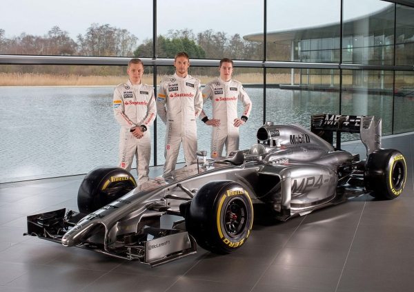
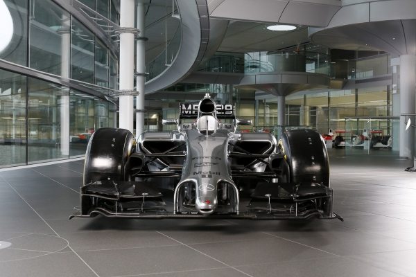
McLaren continues to use the “MP” naming scheme with their all new MP4-29 F1 Car. Their new vehicle looks extremely sleek and agile and considering their easily accessible resources to aerodynamic testing they should post good numbers during the season.
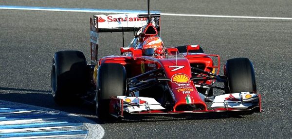
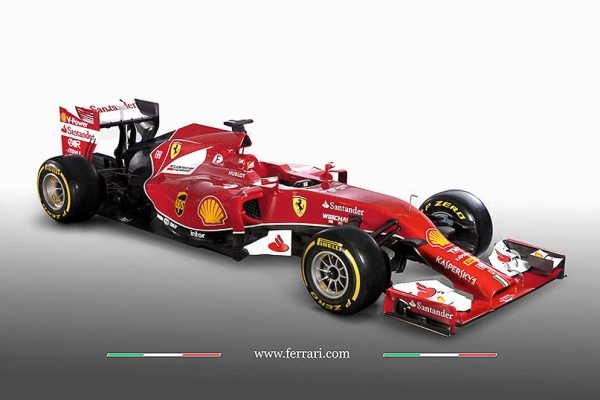
Scuderia Ferrari is one of the few teams ditching the “Gonzo” nose and going for this sleek vacuum-machine looking front face. The All new F14 T is sure to make a presence once out on the tarmac. With seasoned veterans like Kimi-Matias Räikkönen on the team, Ferrari has a good chance at dethroning Sebastian.
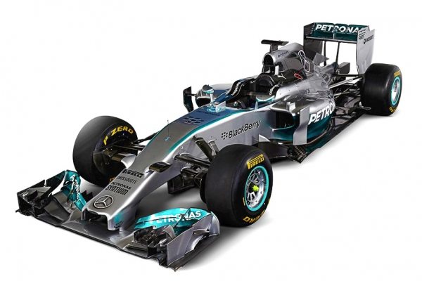
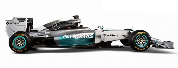
This is the Mercedes AMG Petronas car following or arriving at the same visual outcome as Ferrari with their W05 Formula 1 Car. I personally feel, at least stylistically, this is the best looking car of the bunch. I really dig the color scheme and the choice of not rocking the “Gonzo” nose is a plus in my book.
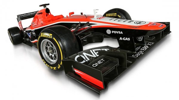
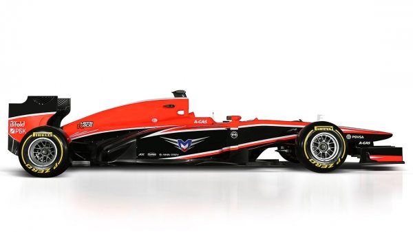
Marussia’a MR02 seems to retain the traditional look the most compared to previous Formula 1 designs and has the least “nose” inspired design. Like I said before it will be interesting to compare the results of those rocking the “Gonzo” nose from those who are not.
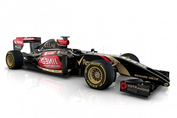
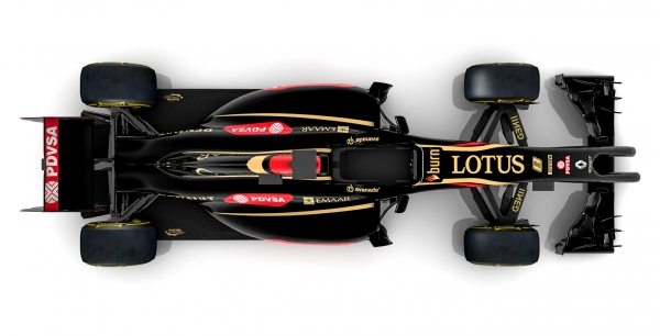
Lotus went for an asymmetrical design with the only example of a double nosed car. The E22 Formula car is already causing a stir as some have questioned its validity in the group. The off-length nose pairs is something to truly behold.
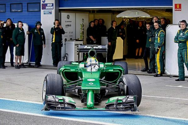
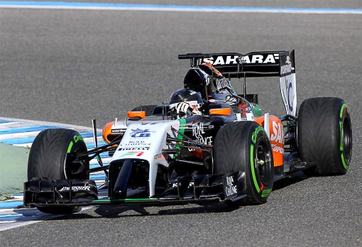
Both the Sahara Force India Team and the Caterham Team rock the most blunt “Gonzo” nose of the entire Formula 1 line up. their designs don’t gradually meet up with the rest of the car’s body and could even be potentially restrictive in terms of aerodynamics. However, we said we wouldn’t talk technicalities and can all agree that these are the most odd-looking of the bunch.
Well there you have it, the entire line up of Formula 1 cars running in 2014. Let us know what is your favorite design and let us know which one did a poor job at executing the car according to current F1 regulations. Sound off in the comments if you’d like (the cleaner you keep the comment the more likely it is not to get deleted lol).
If you wan to further learn about the cars feel free to follow the links below and check out more imagery of the new F1 Racers!

